
September 28, 2013
BBQ BLACK BEAN PIZZA

I have made this BBQ Black Bean Pizza the last three days in a row and I'm still not tired of it! I found the recipe on one of my go to food blogs called Budget Bytes. The recipe is so simple it literally takes 10 minutes (besides preheating the oven) and is so satisfying. Just make sure to poke some holes in the tortillas before you bake them or they will puff up. This is delicious.
September 27, 2013
INTERVIEW WITH SASHA PROOD


I've been back at school for a month now (but it feels like a lot longer) and one of my first assignments was to interview my design hero. Sasha Prood's work came to mind. I first stumbled across her work on Behance and was immediately entranced. If you are not familiar with her work I highly recommend you check out her website. Her precision to detail and her typography with watercolor is absolutely stunning. I was so excited when she responded to my questions and am so excited to share them with you below! The second part of the assignment was to create a poster in the style of our hero for the presentation we will be giving to our class. This poster truly made me appreciate her abilities, because trying to control watercolor is not easy.
Interview with Sasha Prood:
1. In this digital era, how much time do you spend working off the computer vs. on the computer? Do you like to keep a balance? Which do you prefer and why?
I tend to work on and off the computer about 50/50—this balance works well for me. I like the combination of making things by hand and then using the computer to refining and arrange them. I don't prefer one medium over the other—for me, it is fun to mix them all up and work in a variety of different ways throughout each week.
My work is very personal to me, so I suspect that different aspects of my personality show through in each unique piece.
I like watercolor because it is applied to paper, you can create amazing colors and you can only control it so much. I love that unpredictable, organic aspect of painting with watercolor. Unlike many other mediums, watercolor, graphite and ink can be used in a 'messy' way or a clean way—I have always seen these mediums as having a good balance.
My initial passion for letterforms stems from my time at Carnegie Mellon's School of Design learning typography. My transition into illustration was through hand lettering and overtime has evolved to include non-type illustrations and patterns as well.
I promote my art in a variety of different ways including having a personal portfolio website, a Behance portfolio website and being a part of my representation's portfolio websites. I participate in interviews and features with books, magazines and blogs. Additionally, both my representation and I sends out promotional material.
My career path developed organically. I started off as a print designer doing marketing materials in-house for fashion retail brands. While doing this work I got back into drawing and painting, which is something that I have done all my life. These drawings and paintings began to work their way into my designs and eventually I transitioned to full-time freelance as an illustrator.
My advice to new graduates is to find your unique visual voice and apply it to everything that you do.
September 05, 2013
WINTER OLYMPICS

The 2014 Olympics are coming up and they are taking place in Sochi, Russia! I love the winter Olympics. I think ski jumping is my favorite sport to watch, closely followed by bobsledding.
On a more serious note, Russia is banning all propaganda that supports homosexuality. This means anything that supports LGBTQ athletes will be punishable by law. While LGBTQ athletes are still able to compete this is a hinderance to their performance. To support those affected, a friend of mine, Kyle Franklin, is doing an online art project for the 2014 Winter Olympics called Golden. His project is based on propaganda that will be band at the Olympics and gives support to the LGBTQ community. Anyone is allowed to submit their posters to the project. Please check it out!
This poster is my contribution to the project.
July 27, 2013
HAPPY BIRTHDAY CARDS


Two birthdays in one week!
I decided to make the same card but use different colors. My boyfriend's mom recently let me borrow some of her really awesome metallic acrylic paints. I wanted to try them out and this was the perfect opportunity! I drew the type by hand and then cut it out with an x-acto. Painted the paper with the metallic paint and glued it to the front of the card. After that I made the envelope and added a bright festive color to the inside. Ta-da!
July 14, 2013
BEFORE & AFTER NO. 2

Before: My sister bought a pair of shoes that she thought fit her. She was in denial. Lucky for me though, because I got a free pair of shoes! The only problem was the elastic was slightly to big on my feet and the double crossed bands were too busy. Looking at them NOT on a foot I really like the way they look. But as soon as I put them on all the line quality disappears and looks ....awkward.
Plan: The plan is to make these shoes less busy by removing some of the bands.
Action: Because these were elastic I felt confident I could easily fix them. And it was easy! All I had to do was remove the stitching on the heal of the foot (where all the elastic was sewn). Next, I figured out how I wanted them to overlap and what I wanted to remove. I trimmed some of the elastic off so it fit my foot better. Sewed it back up again without the second set of bands. To remove the extra bands that were glued into the shoe I heated it up with a hair dryer (to get the glue hot). Then all I had to do was pull out them out.
After: I'm excited to wear these out. This is a huge improvement. And considering I have never altered my shoes before, I'm happy with this experiment.
July 10, 2013
POMEGRANATE ROSÉ SUMMER SPRITZER

Finally an adult!
It was a low key birthday, but lovely all the same. My sister flew out all the way from Germany to come visit. She also made this delicious festive Pomegranate Rose Spritzer. It was refreshing and beautiful! I definitely recommend you try it! She's a giant foodie and this year I helped her start a food blog so go to her website click here. To go to wine spritzer recipe click here.
July 05, 2013
CARE PACKAGE


For the summer I returned home to North Carolina, but my apartment mate is all the way up in Ohio. She rarely gets care packages and I know she would love one. Every time I get a care package from my mommy it makes me so happy. She could literally send me anything and it would still be fun to open. One time she included an onion, a lemon, and a can of tuna. So literally anything.
Care packages are fantastic. Seriously. Who doesn't like being thought of?! So when I found some adorable shoes in my friends size for four bucks at a thrift shop I jumped on the opportunity to make her a care package. I included some candy, makeup, and a whole bunch of presents for our kitty Izzy.
First I wrapped everything up in white tissue. Then I made a stencil for the name tags and painted each one individually. I added the "to" and "from" and attached those with some string. Next up was figuring out a card. I wanted to keep it uniform with the rounded edged squares. I turned it into an accordion style card and I changed up the look by adding a pattern to the front with a belly band. One letter is for Anna from me and the other is for Izzy from Tibby (my kitty at home). Knowing her I know how much she will appreciate all the small details.
June 30, 2013
VERY BERRY CAKE
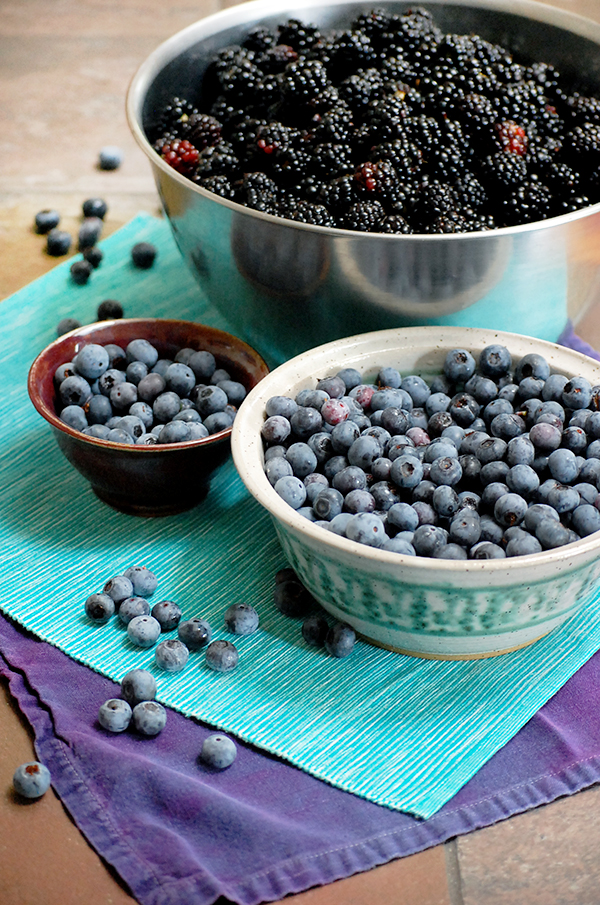
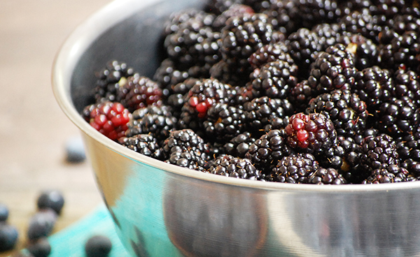
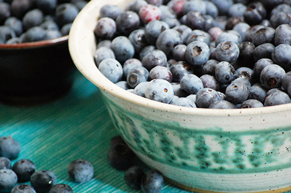
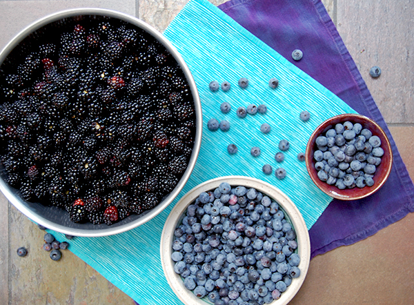
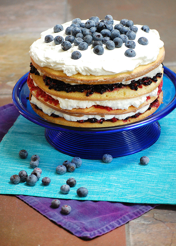
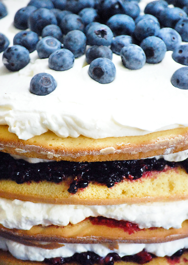
Yesterday my mom came back from the garden with a comical amount of berries. There were at least 12 cups of blackberries and another 8 cups of blueberries. This is definitely not a problem. But what do I do with all these beautiful fresh berries is the question?
I decided it was time to make a cake. I used yellow cake and put it in four different pans so I could fill each layer. The first layer is blackberry, second is raspberry, and another layer of blackberry for good measure. I also added whip-cream to every layer. Because I can. I topped the cake with more whip-cream and blueberries. It's almost all gone less than 24 hours later.
June 27, 2013
FIGURE DRAWING SERIES


This was a composite anatomy series I did a year ago for a figure drawing class. I finally fixed it up so it would be presentable for the web. If you like this project please go to my Behance and click the appreciate button! That would mean so much to me.
The project criteria was very basic. We just had to incorporate the figure in some way and start with a basic set of media and find new techniques to use them. There was a lot of trial and error.
June 20, 2013
BEFORE & AFTER NO. 1


Before: This was my mothers shirt from back in the day. I have always liked this shirt. The cobalt blue stitching is all lovingly done by hand. However the shirt is much too bulky for me and the sleeves make me feel a little frou-frou.
Plan: To make this into a more modern shirt and slim down the figure.
Action: Undo all the hems. Take off the sleeves. Undo bunching around bust. Iron and resew bust. Undo bottom hem. Take off unnecessary fabric on sides and resew. Hem the sleeves. Resew bottom hem. Wash with a lot of oxiclean to remove yellowing. Iron and wear!
After: Very happy with how this turned out! When I'm wearing it the shoulders have a really lovely lift. The shirt feel much more modern now that all the unnecessary fabric is removed. This is going to be a great shirt.
June 19, 2013
WEEKEND TRIP


30 years ago my crazy parents had a dream to build a cabin. So they did. They bought some property in the mountains and a log house kit. After five years of hard work they were finished. We still have the cabin but rarely find the time to go up there. My dad has always loved going to the mountains, getting away and enjoying nature. So I figured this was the perfect place to spend fathers day weekend.
Everything was in green and luscious. The flowers were in bloom painting the field yellow, orange, and white, with flecks of purple. A Willow Flycatcher had built its nest in the eves of our cabin. We could watch it feed its four baby birds while we ate dinner. A snake was found taking a nap above our front door, which we lovingly asked to move to another location. A skink sat soaking up the sun on a rock. Besides getting bitten to death by bugs it was a lovely trip.